Covid Data Analysis
This program was created using SQL and Tableau. I used Microsoft SQL Server to write the queries and Tableau public for the visuals. This project was part of my learning process in practicing SQL and applying it to Tableau. This project consists of using data collected from 'Our World Data', where the data is updated daily ( https://ourworldindata.org/covid-deaths ). Then, using SQL to organize the data and to produce visuals that allow for easy analysis of the data.
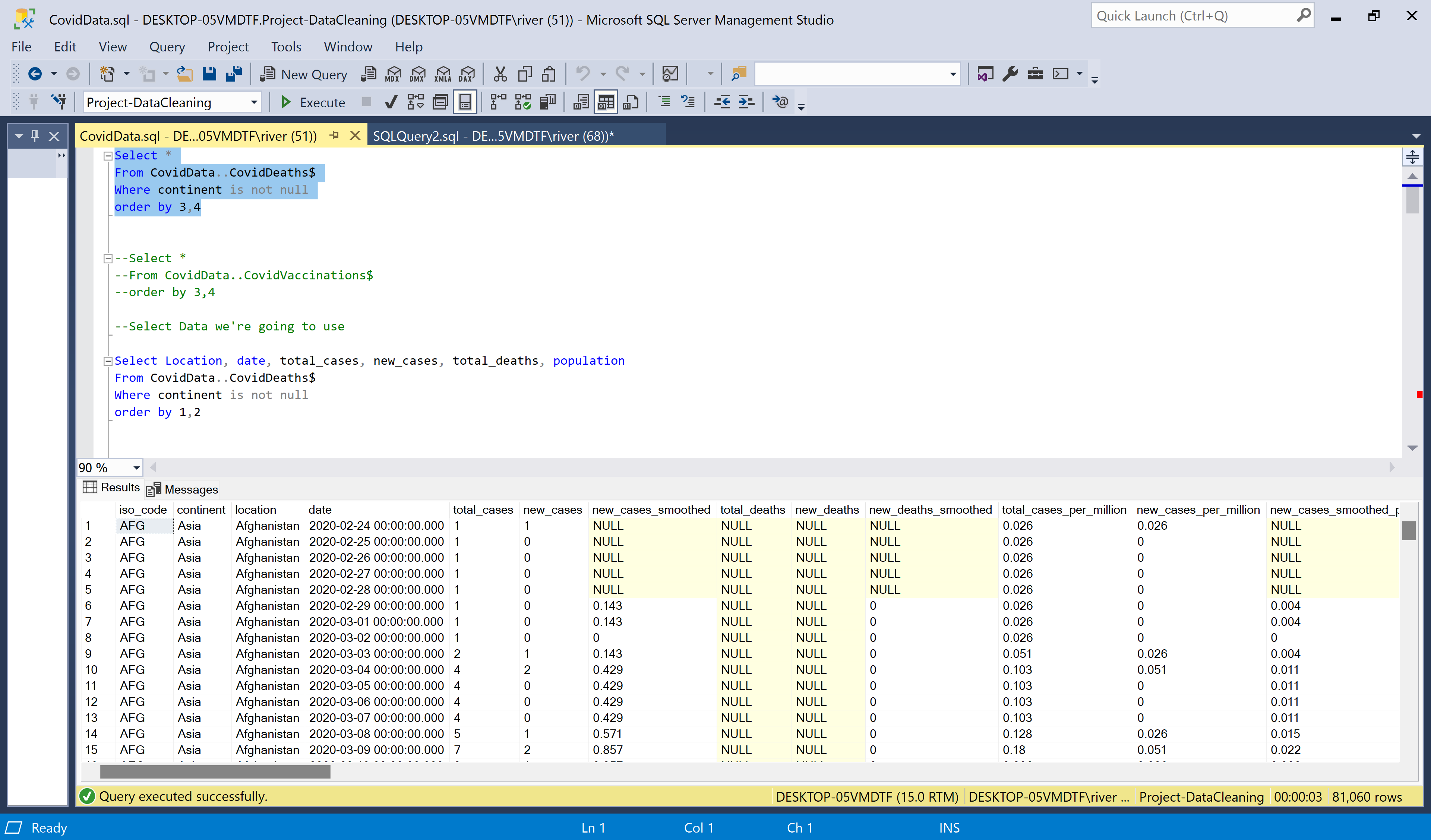
I didn't use all of the data that is provided for quality purposes. My focus was mainly on the way the pandemic spread throughout the world. When writing the queries, I manipulated the data to make tables where I could observe correlations in the numbers while also comparing between countries. Through this, the queries I practiced included organizing columns so I could see the total cases of Covid vs. the new cases of Covid. Also, using the data and providing new percentages to forecast the likilhood of death in case of infection. Futhermore, I used the data to create common table expressions (CTE) where more information can be gathered. Writing these queries and observing the results not only helped me practice SQL statements, it also showed me how valuable organizing large sets of data can be. The queries written can be found in this github repository: https://github.com/kathyrivera9/SQL-Covid-Data
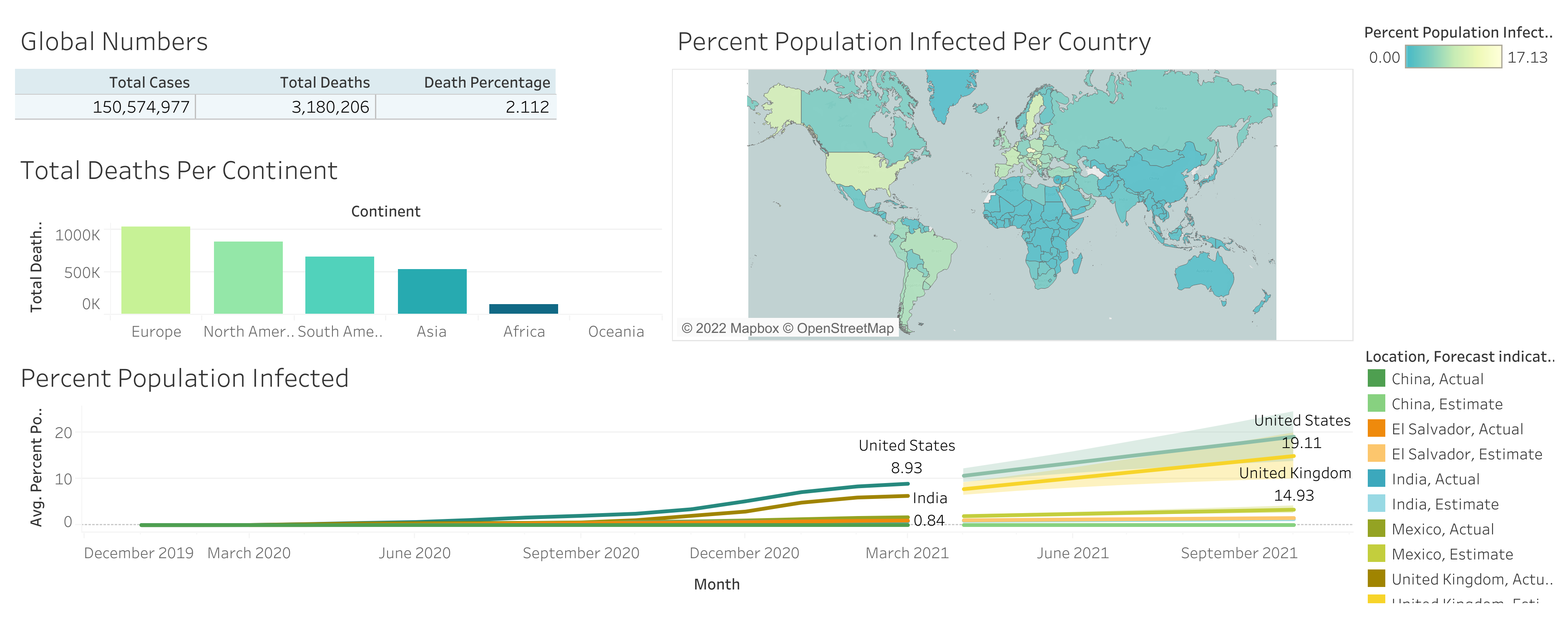
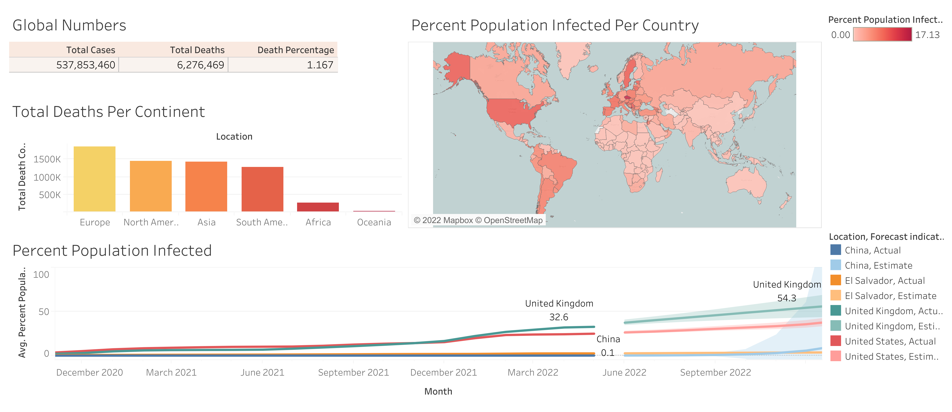
I also used Tableau to help visualize the large amount of data of Covid. I used two different sets of data to create the two dashboards above. The dashboard in the middle contained data from 2020 to 2021, this was the original data set that I used to learn how to make visuals in tableau. The dashboard on the far right contains more recent data up until 06/21/2022. I decided to redo the dashboard with more recent data to make it more relevant. However, both dashboards have similar purposes. They show Global numbers, deaths per continent, and even a map to visualize which countries had more infections. This can all be found in the data queries, but seeing pictures is more pleasing to understand the data given.
And the visualization is more clearly seen in my Tableau: https://public.tableau.com/app/profile/katherinne.rivera#!/?newProfile=&activeTab=0